# Part 2: Design System
Project Overview
Read the project overview here
# Introduction
In Part 2 of this project, we aim to craft a concise design system for your website. A robust design system ensures consistency throughout your website and simplifies the visual design process as many elements are predefined.
You may refer to any UI Kits like Bootstrap to help you complete the exercise. By this I mean that you can look at UI kits to help you with sizing of things like fields and typography. You cannot use components or elements created by another designer
# Requirements
For your design system, you must incorporate:
# Week 10
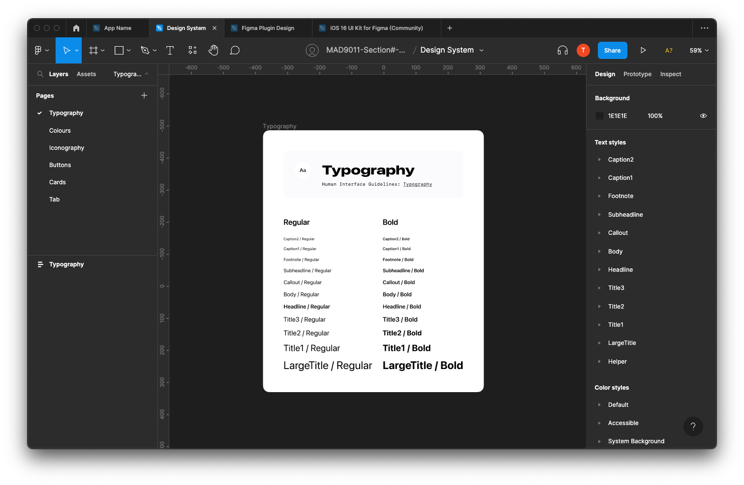
- Typography: Define your website's fonts, sizes, weights, and line heights.
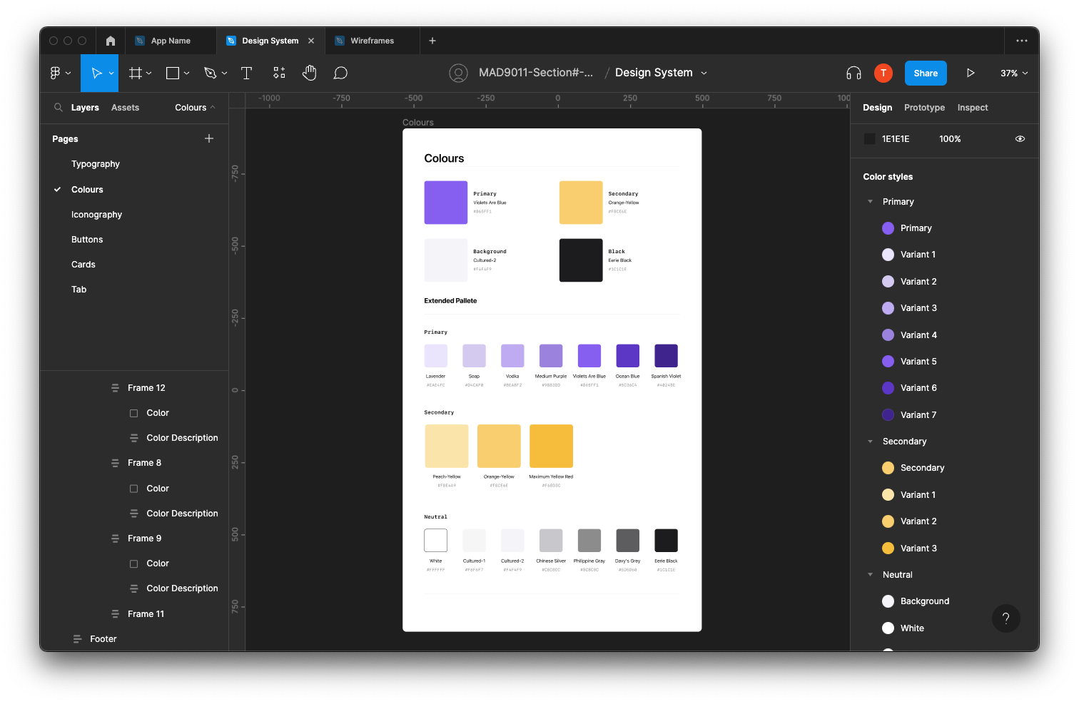
- Colours: Establish a color palette, including primary, secondary, and accent colors.
- Iconography: Choose or design consistent icon components for common actions and indicators.
- Buttons: Design button styles, including hover, active, and disabled states.
# Week 11
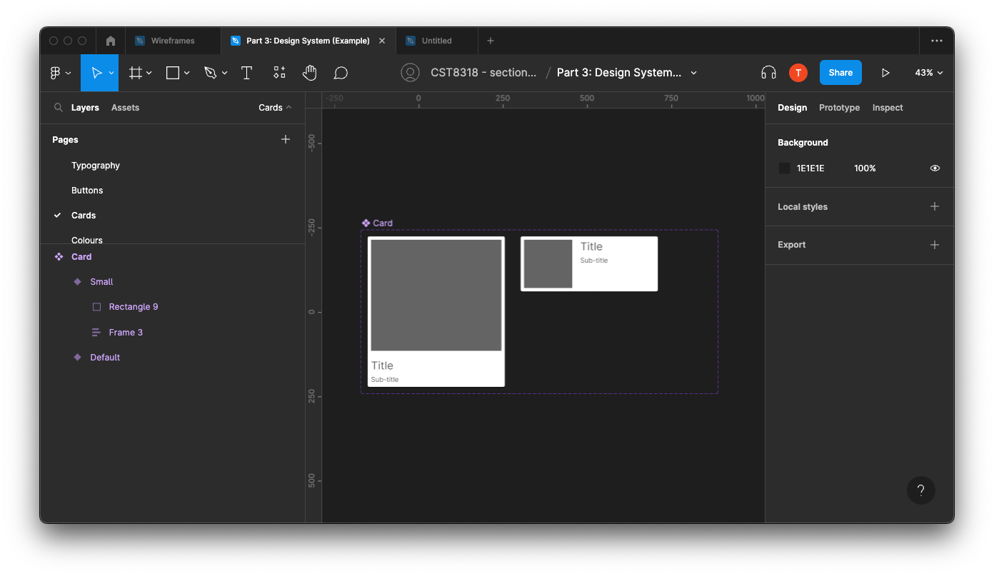
- Cards: Structure card elements for content presentation.
- Fields: Design input fields, dropdowns, checkboxes, and other form components.
- Navigation: Create designs for menus, breadcrumbs, tabs, and other navigation elements.
# Steps to Get Started
Setup: Create a new file within your project and name it "Part 2: Design System."
Categorization: Establish separate pages for different components of your design system, such as:
- Colours
- Typography
- Buttons
- Cards
- Tabs
- And more
Typography: Detail your typography choices, including size, font family, and weights. (This just an example, you do not need to recreate this exactly.)
Color Palette: Define your color selections, distinguishing between primary, secondary, and accent shades. (This just an example, you do not need to recreate this exactly.)
Component Identification: Review your low-fidelity wireframes to identify necessary components.
Component Creation: Develop your components on their respective pages, ensuring:
- Components are appropriately named.
- Variants for different states or versions are created.
(This just an example, you do not need to recreate this exactly.)
Global Styles: After defining your colours and typography, formulate "global" styles for each. Proper naming conventions are essential.
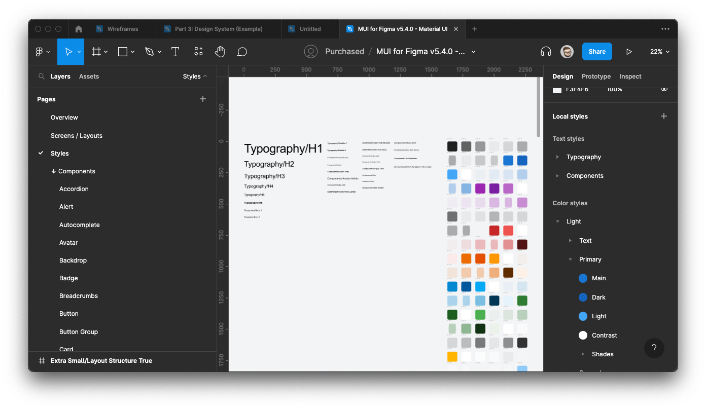 Note: The number of styles in the example might exceed what you'll have, as they are from a comprehensive Design System.
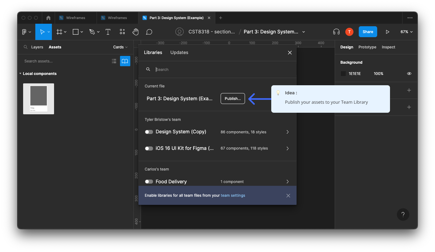
Publishing: After completing your Design System, publish your assets to your Team Library.
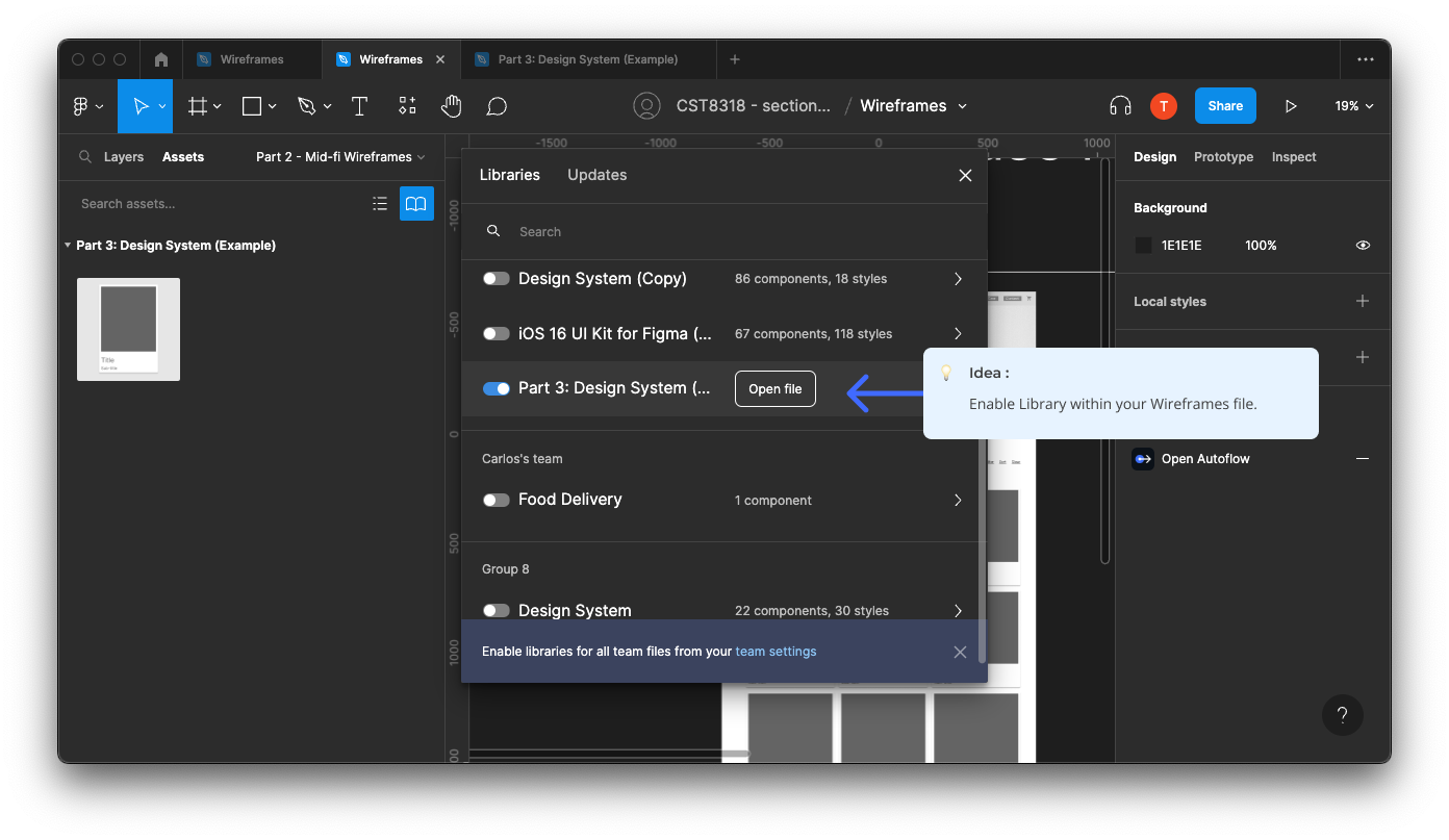
Integration: In your Wireframes file, enable access to your design system.
# Evaluation Criteria
# Setup and Categorization
- [ ] A new file named "Part 2: Design System" is created within the project.
- [ ] Separate pages for different components (Colors, Typography, Buttons, Cards, Tabs, etc.) are established and clearly labeled.
# Typography
- [ ] Fonts, sizes, weights, and line heights are clearly defined and documented.
- [ ] Typography choices are consistent with the website's theme and usability principles.
# Colors
- [ ] A color palette including primary, secondary, and accent colors is established.
- [ ] The color palette supports accessibility standards (e.g., sufficient contrast ratios).
# Iconography
- [ ] Consistent icon components for common actions and indicators are chosen or designed.
- [ ] Icons are understandable and align with the overall design language.
# Week 11 Components
- [ ] Button components have been created.
- [ ] Card components have been created.
- [ ] Needed input field components have been created.
- [ ] Needed navigation components have been created.
# Component Creation and Global Styles
- [ ] All components are appropriately named and organized.
- [ ] Variants for different states or versions of components are created.
- [ ] "Global" styles for colors and typography are formulated and named following proper conventions.
# Publishing and Integration
- [ ] The design system is published to the Team Library, making it accessible for use in other files.
- [ ] The wireframes file has access enabled to the design system for seamless integration.
# Submission and Documentation
- [ ] Figma project link is provided.
- [ ] The app's chosen theme is described.
- [ ] A list of all group members is included.
# How to Submit
Your submission will be through Figma's sharing feature. In your submission comment, please include:
- The Figma project link
- Your app's chosen theme
- The names of all team members
Make sure your professor has been added to the Figma file with editing permissions.